'House Of Wax' Film Trailer
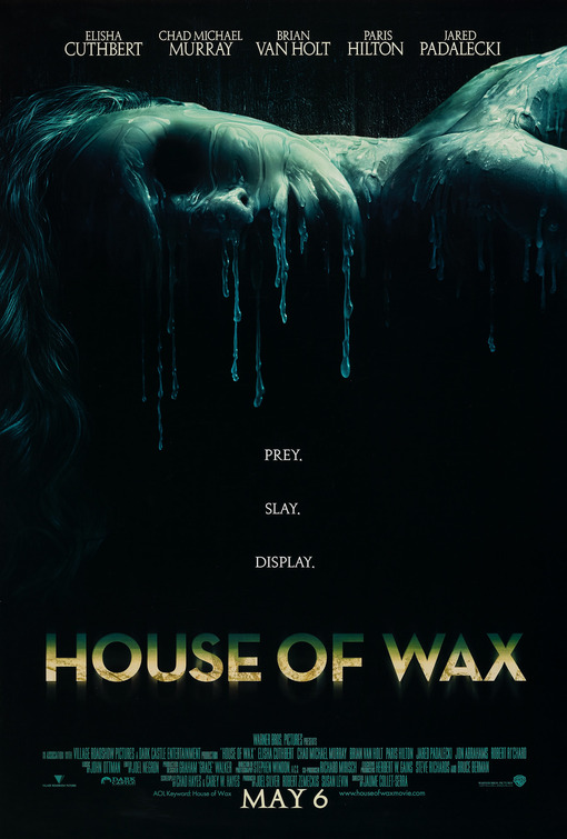
The main image of this poster is a woman lying down with her face melting as if she is wax. The background is black and dark, with the image being a very saturated blue. The image gives us an idea of what the film will be about, it allows us to question what it will be about, there is still an element of mystery. At the top of the poster, there are the names of the actors in the film including Elisha Cuthbert, Chad Michael Murray and Paris Hilton. They are well known actors so that alone would influence someone to go and see the film if they know and like one of the actors.
The title is aligned in the center at the bottom. The font is bold but very simple to read fading from a green to a yellow with a glowing shadow. The colours and effects make it stand out on the black background.
Underneath the title, there are a list of the credits and everyone involved in the film. The text is in the same dark green colour that half of the title is in.
Below this is the date the film is released 'MAY 6' which is in slightly bigger font than the credits as it's a very important part of promoting the movie.
Another important element of this film poster is the caption in the center of the poster. The text reads 'Prey, Slay, Display' which makes us wonder what this could mean. It's distributed over three lines, all lines rhyming.
This poster fits all the main conventions of a successful film trailer. I will look at this poster when creating my own as it has very clever conventions.

'Dead Snow' Film Poster
The main image of this film poster is zombie looking men in the army. One of their heads has been cut off with a bloody chainsaw and is in the snow however he is still alive. The main element of this photo is all the snow in the background. The title of the film is 'Dead snow' and the image fits this, a 'dead' zombie in the snow. This challenges the common conventions of film poster images as mostly, they are black or a dark colour. It's rare that it is white, however i can see why they have done this. They have done this as it's what the film is about.
The title is done in a simple font aligned centrally at the bottom of the poster. In each letter is an image in black and white from the film. The images feature the main characters, guns and weapons and crowds. This allows us another small little insight into the film.
Underneath the title, also centered, is the directors name 'Tommy Wirkola' - this is in red font to match the blood on the chainsaw, and blood in the snow.
Underneath this is a list of credits of the actors who appear in the film, producers, sound technicians etc. It's important to have a list of everyone who is involved.
Below this, is the film company logo.
This is a film poster that does not fit all common conventions of horror film posters.

'Inglorious Basterds' Film Poster
This is a film poster for 'Inglorious Basterds' - A film by Quentin Tarantino. This must have been a poster released before the date and certificate were decided and even possibly before they started filming.
The genre is clear, it's a film about the second world war, we know this as it says 'Once upon a time in Nazi occupied France...' at the top which sets the scene and genre.
The main image of the helmet hanging from a bloody baseball bit makes it clear the film will be violent which indicates it will probably not have a lower certificate rating than 15. The colours used represent the 'darkness' of the film, the dark shadows of the image creating contrast. We know just from the poster that the Nazi Germans are the enemies as there is a swastika on the helmet.
The title is below the image with the 'O' of Inglorious being detailed, with a swastika in the 'O' with an eagle sitting on top. It looks like an army badge obtained in the war. The font is simple, in black capital letters to make it stand out from the cloudy, foggy, grey-green background.
The directors name 'Quentin Tarantino' is included directly below the title, this is because he is a very famous director who's films have all been a big hit picking up numerous awards. If people like his films, they will see his new films regardless of what genre they are.
Underneath that, it reads 2009 in red letters which is the year they know the film is coming out. Being in red allows it to fit the whole feel of the poster which consists of black, white, red and dark green/grey. The red matches the colour of the blood on the baseball bat.
In the bottom left corner, the 'universal' logo is included and the film company logo next to that.

'The Crazies' Film Poster
This poster fits many of the conventions of a horror poster. The image is dark which results in the background being almost black which is associated with horror and death. The background image is the silhouette of a man dragging a pitchfork along the floor, he's wearing dark trousers and big black boots which fits the mise en scene of a horror film. It's hard to tell if the image is black and white or not, if not, most of the colour has been trained to create a dull feel to it, with just the light of the hallway illuminating the silhouettes.
The colour scheme for this poster is mainly black, white and red. The title is in red capitals aligned to the right of the poster (as is the rest of the text, the caption credits etc). The font used reminds me of a large toxic plant or something similar, it's easy to read and it immediately catches your eye - being the only thing in red on the entire poster. Underneath is the caption in a more subtle white reading 'Fear Thy Neighbor' which gives us an insight into the genre of the film. It makes us realise that the film will be set in a small (possibly religious because of the use of 'thy') community where something goes horribly wrong.
The credits are underneath featuring the name of the actors, directors, producers etc. This is an important part of marketing the film and it gives all the people involved in the film recognition. The film company logo, sound company and others are featured small in white like the rest of the information.
No comments:
Post a Comment