Wednesday, December 15, 2010
Tuesday, December 14, 2010

Thursday, December 9, 2010
In what way does your media product use, develop, or challenge forms and conventions for real media products?


How effective is the combination of your media products and ancillary text?


What have you learnt from audience feedback?


How did you use media technologies in the construction, research, planning and evaulation stages?
 wide range of media technologies to construct,
 Also one of our primary tasks we did was to watch three different film trailers and analyze them using a grid of 9 method.
 200% to create variety in our horror trailer. To find the song 'Rammstein - Mein Teil', we found a band we liked using the website myspace then viewed a few of their songs. From previous knowledge, we knew they would fit the mood perfectly, it was just deciding which song to use.
Our Magazine Film Cover


(Left Image)
Through looking at film posters and analyzing film magazine covers, we observed that there was a strong link between all the promo work for one film. With this in mind, we kept the same image as the film poster but added changes and improvements to it making it look more like a professional magazine cover. We found this fairly easy as for our AS media studies coursework, we had to complete a magazine cover 'set'. Firstly, we used the dodge tool to lighten parts where we were going to add text and images so it would be clear for the audience to read.
(Right Image)
We decided to firstly add the most important elements to the page, such as the title of the magazine and logo. These will hopefully grab the audience's attention and they will be the first thing they read. Next to the title, we added the logo so the audience can immediately link the name and logo together every-time they see it. We added the barcode in the top right of the magazine cover as it fits nicely in the corner and is very discreet. We added a headline underneath reading 'First Horror Film Magazine'. We done this as it shows the companies individuality and how they are targeting quite a small audience and are trying to introduce something new, we wanted to audience to know that. It reflects the high quality of the company. 'Best Film of the year' is written just under the caption and we have chose to colour it in red because it symbolises blood which gives that horror effect and it also links to the theme of colours on our magazine.


(Left Image)
We added more text and information into the white 'dodge bubble' we made on the left. We included other features, offers and articles that would be in the magazine. We have decided to place them at the size so it does not take away the audience's attention from the main image. We have used a small simple font for these features as it's not as important as the main story however is still there for the audience to read. The dodge effect also blends in with the trees which gives a horror effect.
(Right Image)
Lastly to fill up the magazine cover a bit, we have included images that would be linked to the other stories with the magazine, we cut out the picture of the head so there would be no background, the colours all blend in so well together. the pictures advertise different films out as well however the size of the advertisements show less importance and the attention is then aimed towards the main image. little colour is used as possible otherwise the black and white image would be over taken and the audience would be more attracted to the colour around the image.
Film Magazine Ideas
2) Media
3) Action
4) Report
5) Angle

ReportReview
Rate
this would all be included in the magazine which is another reason why we chose to make it stand out. We needed a logo to go along with the title and it wasn't hard to find one because we searched on google and found this one straight away. we felt we needed a logo because other film magazine have one also it needs to be reconized around the world but the public and this logo seems perfect for the job!

This is very steortypical object to do with film however we did want to keep it simple and easy and reconizable.
Wednesday, December 8, 2010

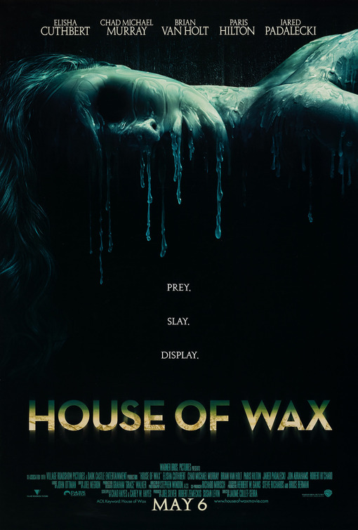
Our Film Poster

Analysing Film Covers


Wednesday, December 1, 2010
Film Trailer Re-shoots
 Above is a list of shots that we firstly did which were not entirely sucessful. We identified the problem with them and organized another two days on which we could re-shoot them.
 Here is the storyboard for the six shots we have decided to reshoot. Drawing them will help us remember how the shot will be exactly shot.
We need to organize our re-shoots as we would like every single shot in our film teaser trailer to be perfect.


Analyzing Film Posters