Thursday, December 9, 2010

In what way does your media product use, develop, or challenge forms and conventions for real media products?

Through looking at the conventions of media products, i can identify how mine fits and challenges forms.
Our media video fits many conventions. Firstly, our use of music. As i have previously stated,
we started off with a slow classical simple sounding music then a
'metal' genre song by a German band called Rammstein. In between the interchange back nearing the end of the trailer, we added a bang, screeching kind of n
oise to separate and link the two.


Also through analysing film trailers, we realised they add an MPGG green screen at the beginning to notify the audience of what rating the trailer is. Also they featured the film company name so we featured this screen too. We chose Lionsgate as our film company as through researching, we discovered it produce
s lots of succes
sful horror films such as the series of SAW films, Hostel, Haunting in Connecticut, The Devils Rejects among many famous
others. These two screens fade to black in between which we noticed professional film trailers do so.

The pace of professional film trailers is vital in attracting the tar
get audience and maintaining their interest. We achieved this by introducing a slow paced first section with longer clips fading into one another then fast paced section at 39.3seconds. We also added each c
lip on so it commences at the start of each film clip that we used. Also, we used very calm feeling shots for the first section, this makes the audience feel relaxed and unsuspecting. It makes them more interested in the film trailer, what could possibly happen next?
Whilst w
e were editing, we realised some of the shots were too long and that our target audience could possibly lost interest quickly. To resolve this issue we clipped the length of a couple of the shots.
We used a variety of filming techniques that most horror film trailers also used, for example the hand held camera shots. This gives a feel like the viewer is the protagonist/antagonist. One of our shots that i really felt was excellent was the couple of shots we used from behind the bushes. We positioned our light source accurately to have it kind of 'peeping' from behind the bushes and
we did not use a tripod for the majority of these shots. Also, the wind blowing through the bushes creates movement, this could be the antagonist breathing or moving. W
e do not know. The element of mystery is a main convention of horror film trailers. As are shots i
n the view of the killer.

Our film trailer challenges conventions in some parts. The dirty knees and the killer grabbing the protagonists hair.
These challenge conventions because they are 'arty' out of the ordinary shots. The knee shot has a very interesting light source on just the bottom half of the legs. The background is black. It makes the audience question 'Why?'. It's confusing.
Also the hair grabbing shot that we
featured at the end of the trailer does not fit conventions as normally the videos do not show violence and grabs. Also our
audience described this shot as being 'Arty'.


Our poster also features conventions of media products for many reasons. There are also ways in which it challenges these conventions. Firstly, our poster features a main centralized striking image. It also features the same font as our film magazine cover and film trailer. We've featured names across the top which, though analyzing other posters, i know is a common convention of professional film posters. Also at the bottom of the poster, i have featured a list of credits. This is for legal reasons and 90% of all posters have to feature this. The colours
of the poster are dark and most of the saturation is removed. This gives it an eerie feel, most horror film posters do not use bright fun colours, it ruins the effect and could imply the genre is something else.

Our film magazine cover fits many conventions of professional film magazine covers. Firstly, our masthead has a different font from everything else, it stands out and even has a hint of colour to it. We featured a barcode discreetly in the top right hand corner of the cover. This is how the professional magazines usually do it! The barcode is not meant to be an important element of the page. We centralized the main image (using the same one as the film poster to create a synergy). We added features on the left hand side. Our film magazine cover fits all the main conventions of a professional film magazine cover!

Most aspects of all three of our media products use conventions of real media products. However our horror film trailer challenges some forms to an extent. Our media products could be real media products as we have followed conventions.

How effective is the combination of your media products and ancillary text?

To create a trailer, film poster, and a film magazine front cover that all combine and link, we used the same images for the film magazine cover and the poster. If they are all strong, they stand as a synergy which is the theory that three elements are stronger than one. All three must link and be powerful.

We achieved this by firstly creating our magazine cover and our film poster. We used the same image for both which immediately linked the two of them together. The trailer also links to these two as the image of the country road used is set in the same place as the trailer. This is a pho
tograph of our location when we filmed.
Through analysing and observing other film magazine front covers, we knew ours would need
to bold and stand out to buyers. We used the same font for the film title throughout all three elements which makes the film stand out and be
slightly different. It allows the target audience to link a picture to a font style and vice versa. We centralised the portrait image on the front cover and featured text relating to the articles involved in the magazine. We used the same text throughout (featured underneath) to create synergy.
This way viewers/buyers can see there is a distinct link between the film trailer and magazine cover. Overall I think the combination of each product works well together and makes our three items consistent, making them all relate to one another.

What have you learnt from audience feedback?

As you can see, i have featured four different polls on the right of my blog for viewers to fill in. The one on the
left is a prime example, i asked if the audience what would be an appropriate title for our horror film. The majority answered 'The Last Drive' and one answered 'The Infant'. It was a clear cut between what the best name would be. In the end, we called our film 'The Last Drive' which is appropriate to the storyline and the audience agreed. To impro
ve my results, i would have liked to ask a bigger sample of my target audience.

We allowed around 10 of our peers to watch our trailer
and comment on what they liked and
did not like. I think this is an excellent way to obtain audience feedback and we can get a clear cut honest view of our video. They firstly commented on the content and mise en scene of our video. For example the distress on
the protagonists' faces was well acted, the clothes fitted with where they had been and helped tell a bit of a story without giving too much away. Also many of the audience commented on the location.
They felt the location was excellent however more 'forest' shots could have been used to show a larger variety of scenes.

From viewing our target audience's reactions, we realised that the two songs we chose were a very good choice. Most of our audience knew the fast paced 'Mein Teil' by german band
Rammstein as they're mainstream and relatively well known and also, our target audience would know them as they like horror films and metal music. The two go hand in hand! Also many of the men who watched our video knew it as it is the soundtrack for xbox/playstation 3 game 'FEAR 2', it was familiar to them. Also the audience commented on how the theme of children, prams and babies was constantly running through the trailer. We achieved this by using the first song that sounded like a baby's mobile and when that was not playing, we featured more shots of the pram.

The camera angles that we used were commented on. We featured lots of medium to medium long shots in our trailer, we could have varied these a little bit more adding more low or high angle shots however we did want to keep our trailer simple and easy to watch.
We could have also used more low angle shots for the antagonist however as we did not feature his face or the majority of his body, that would have been hard however would have fitted conventions.
Also, the audience liked how mysterious our trailer was, how we did not show the antagonists face and the medium close ups of the protagonists used. It really set a feel to the trailer.

Our cross fades and additive dissolves used were commented on by a couple of our audience. They said they really fitted with the slow transitions of each shot and captions, using quick choppy cuts in the intense section was the right thing to do.

The green rating screen at the start and the Lionsgate film company logo screen were a very good element of our video. They are two main conventions of professional film teaser trailers and the audience commented on this. Our captions that read;
'Can you drive away from your past?
And look forward to your future
what if someone doesnt..
let you, forget.'
were very well received by our viewers and were commented on as being genuinely scary.

We have learnt from audience feedback that our Horror film trailer fits all the main and important conventions of professional trailers and that the majority of our target audience would go and view this film in the cinema. They described our trailer as 'mysterious' more often than not and that really is the look and feel we were going for.
Through feedback, we can see why mystery was a good ongoing theme and how it influences viewers to see the film.

How did you use media technologies in the construction, research, planning and evaulation stages?

Throughout our entire project, we used a
wide range of media technologies to construct,
research and plan all stages of our project.

Firstly we used a High Definition camera that we were lent from our school media department
along with a tripod that we used to rest it on so we could develop the most stable shots
possible. The camera took a while to master, the auto focus was playing up at first but once we placed it on the
tripod, it auto-focused a lot quicker and easier. The conditions were affecting it, the dark wasn't great! We would not have been able to complete our project without filming.


To conduct our research, we used an Apple Mac computer. Firstly we needed to gather images of film posters, film magazine covers and information on other various aspects.
Also one of our primary tasks we did was to watch three different film trailers and analyze them using a grid of 9 method.
To watch these videos, we used 'Youtube' which is a site where videos are streamed. We also used youtube to browse for our horror film trailer's soundtrack. It enabled to us to watch as many horror film trailers as we wanted so we could figure out exactly what we wanted ours to contain. Also, in our video we ended up using a short sound clip from the 'Paranormal Activity' trailer. Youtube also contributed greatly in our evaluation stage. When we were evaluating different videos, we could play them over and over and really work out what the key scenes were, where the music commenced and stopped etc.

Another important technology we used throughout our project is our blogs where we project all our work.

Possibly our most important programme used is Adobe Premiere Pro CS4. This is the programme we used to cut and edit all of our film clips and also layer music, text and sound effects over the top.
We achieved this by first importing all of our filmed footage onto the Apple Mac and imported that into Premiere Pro. We viewed all the videos and wrote down on a piece of paper which ones would be relevant and where we could use them.
By analyzing conventions of horror film trailers on Youtube, we knew we were going to have a slow paced section for the first part of the video then we were going to speed it up, using different 'metal' music to create a fast paced, intense section. Once we had our clips written down in more or less the same order as they are in the final product, we dragged them onto our timeline. We added fades such as cross dissolve and effects such as speeding up the clip by
200% to create variety in our horror trailer. To find the song 'Rammstein - Mein Teil', we found a band we liked using the website myspace then viewed a few of their songs. From previous knowledge, we knew they would fit the mood perfectly, it was just deciding which song to use.

Finishing our project would not have been possible without the technologies we used, especially youtube, our HD camera and Adobe Premiere Pro.

Our Magazine Film Cover

1.png2.png


(Left Image)

Through looking at film posters and analyzing film magazine covers, we observed that there was a strong link between all the promo work for one film. With this in mind, we kept the same image as the film poster but added changes and improvements to it making it look more like a professional magazine cover. We found this fairly easy as for our AS media studies coursework, we had to complete a magazine cover 'set'. Firstly, we used the dodge tool to lighten parts where we were going to add text and images so it would be clear for the audience to read.

(Right Image)

We decided to firstly add the most important elements to the page, such as the title of the magazine and logo. These will hopefully grab the audience's attention and they will be the first thing they read. Next to the title, we added the logo so the audience can immediately link the name and logo together every-time they see it. We added the barcode in the top right of the magazine cover as it fits nicely in the corner and is very discreet. We added a headline underneath reading 'First Horror Film Magazine'. We done this as it shows the companies individuality and how they are targeting quite a small audience and are trying to introduce something new, we wanted to audience to know that. It reflects the high quality of the company. 'Best Film of the year' is written just under the caption and we have chose to colour it in red because it symbolises blood which gives that horror effect and it also links to the theme of colours on our magazine.


3.png4.png


(Left Image)

We added more text and information into the white 'dodge bubble' we made on the left. We included other features, offers and articles that would be in the magazine. We have decided to place them at the size so it does not take away the audience's attention from the main image. We have used a small simple font for these features as it's not as important as the main story however is still there for the audience to read. The dodge effect also blends in with the trees which gives a horror effect.

(Right Image)

Lastly to fill up the magazine cover a bit, we have included images that would be linked to the other stories with the magazine, we cut out the picture of the head so there would be no background, the colours all blend in so well together. the pictures advertise different films out as well however the size of the advertisements show less importance and the attention is then aimed towards the main image. little colour is used as possible otherwise the black and white image would be over taken and the audience would be more attracted to the colour around the image.

Film Magazine Ideas

The first thing our group had to work on and decide was to make up a name for our magazine that our film would be featured on. We could have used a film magazine that is already out such as 'Empire' or 'Total Film' however we wanted to come up with our own and make it individual. Magazine covers advertise the newest films and important features. They are a good way of attracting an audience and educating them on upcoming films.

We brainstormed various magazine name possibilities. They d
o not necessarily directly link to styles of films however we did our research and many film magazines do not.

These are the last names we had to decide from:
1) Snap!
2) Media

3) Action

4) Report

5) Angle

We decided as a group that 'Report' would be th
e best one to include as we are reporting about films to the audience and it sounds the catchiest. it's not long or completed, it's short, straight to the point and easy to remember.

We had to decide on how to present the title with a font and size that would catch the audience's eyes and this is the final design we came up with after trying out so many possibilities.
We chose to colour in the letter 'R' in red to add a bit of colour and fun to it otherwise the title would have been just plain black. Also from looking at conventions of Film Magazine covers, we know that a theme of colours runs through. Ours will be red black yellow and white.

Also, the letter 'R' could also stand for alot of other meanings such as:

ReportReview
Rate


this would all be included in the magazine which is another reason why we chose to make it stand out. We needed a logo to go along with the title and it wasn't hard to find one because we searched on google and found this one straight away. we felt we needed a logo because other film magazine have one also it needs to be reconized around the world but the public and this logo seems perfect for the job!

This is very steortypical object to do with film however we did want to keep it simple and easy and reconizable.

Wednesday, December 8, 2010

Our finished Film Poster

Our Film Poster

Editing our film poster

(Click image above to englarge the process of editing our film poster)

1. Top Left - We were going to shoot pictures of the characters but we wanted to keep an element of mystery to our film poster so we used a photograph from Jessica's AS photography. We added the black and white to effect to it in photoshop elements 4.0. Through looking at film posters and analyzing them, i noticed that most of the photos have all the hue drained from them or are in black and white or sepia. Afterwards, we used the dodge tool to blur and lighten sections of the photo where text would be so it looks readable.

2. Top Center - As our trailer features a pram theme, we thought we could try to incorporate this into the poster. We took a photo of the pram on a white background and then blacked it out to create a silhouette of it, we decided to shrink it and blend it in with the background, also darkening it. This will make the audience think and also give them a hint as to what to expect in the film.

3. Top Right - In our trailer, we feature a protagonist. We do not see his face but just his actions, such as walking, running and the back of his head. We did not want to feature the killers face so we made a silhouette of a man on paint and transfered it over to photoshop. This person in our poster could be the victim or the attacker, we do not know. This makes the audience think, it's mysterious. Also, we edited in the credits at the bottom featuring the producers, sound engineers, film company etc. All posters have this for legal reasons and so they can give credit where it's needed. This is included small at the bottom of our poster so it does not take the attention away from everything else.

4. Bottom Left - The caption at the top of the poster gives an idea if the genre as the font is scary and the word 'Death' is linked to horror, macabre and scary things! The font is kept black and simple and placed over the dodged section so it is clear. We got the font from the website dafont.com and we copy and pasted it.

5. Bottom Center - We added the title in the bottom center of the film poster. We used the same font as the caption featured at the top but slightly bigger.

6. Bottom Right. - We asked our target audience what they thought of our film poster and they said something was missing. We did some research and analyzed some more film covers and we decided it was the actors names. We added these three just below the caption at the top.

Finished.

Analysing Film Covers

Empire magazine - Inglorious basterds

The title 'EMPIRE' is in red capital letters, it's one of the biggest clearest elements on the whole front cover. The theme of the magazine is mainly red and white with small hints of blue and grey. It all links very well, only a select few fonts are used, all of them being simple and easy to read. The image is what attracts readers the most. It's a striking medium long shot image of brad pitt with a knife. His facial expression is interesting and we can purposely see his neck scar in the picture. This gives a tiny insight into the film the magazine is featuring. It reads 'Inglorious' underneath it which is what most people call the film as 'Inglorious Basterds' is considered slightly rude.
The masthead is at the bottom of the cover reading 'Funny People' featuring actors and comedians names. In the top right corner are a few small pictures linking with what's said next to them 'Greatest Movie Moments'. It gives you a small insight into what to expect in the magazine but you will not know fully unless you buy and read it. The website for the magazine is underneath the title, and the price and date above it. They are in small font as it is not very relevant, it's more for reference. The background is part of the photograph used of Brad Pitt, it's a rocky brown grainy background. It gives it a harsh feel. This Film Magazine Cover is very successful, it's striking and features all the main elements and conventions of a Cover.

Total Film - Sherlock Holmes

The main image is of Robert Downey JR as Sherlock Holmes, it's a striking medium frontal shot. The 'total film' title is in bold white letters and still easy to read even with the image overlapping in front of it. The main colours of the cover are blue, white and black. The ongoing theme makes everything look neat. The title at the bottom reads 'Sherlock Holmes' which is the film the magazine is reviewing, it's easy to know that as there is a picture and the title. They link to one another.
A barcode is featured in the bottom right of the screen and the website and date are just underneath the title in small font. Like 'Empire' magazine, there are small images in the top right hand corner of other films featured in the magazine. This is a very successful film magazine cover.

Wednesday, December 1, 2010

Film Trailer Re-shoots


Above is a list of shots that we firstly did which were not entirely sucessful. We identified the problem with them and organized another two days on which we could re-shoot them.

Here is the storyboard for the six shots we have decided to reshoot. Drawing them will help us remember how the shot will be exactly shot.
We need to organize our re-shoots as we would like every single shot in our film teaser trailer to be perfect.

Editing Our Trailer

Our opening shot is of the green screen, this details the rating etc.


Analyzing Film Posters


'House Of Wax' Film Trailer

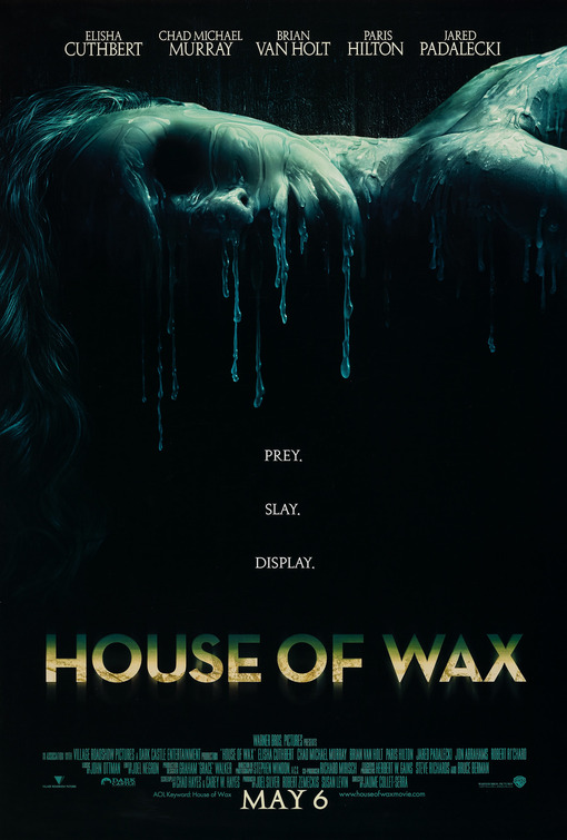
The main image of this poster is a woman lying down with her face melting as if she is wax. The background is black and dark, with the image being a very saturated blue. The image gives us an idea of what the film will be about, it allows us to question what it will be about, there is still an element of mystery. At the top of the poster, there are the names of the actors in the film including Elisha Cuthbert, Chad Michael Murray and Paris Hilton. They are well known actors so that alone would influence someone to go and see the film if they know and like one of the actors.
The title is aligned in the center at the bottom. The font is bold but very simple to read fading from a green to a yellow with a glowing shadow. The colours and effects make it stand out on the black background.
Underneath the title, there are a list of the credits and everyone involved in the film. The text is in the same dark green colour that half of the title is in.
Below this is the date the film is released 'MAY 6' which is in slightly bigger font than the credits as it's a very important part of promoting the movie.
Another important element of this film poster is the caption in the center of the poster. The text reads 'Prey, Slay, Display' which makes us wonder what this could mean. It's distributed over three lines, all lines rhyming.
This poster fits all the main conventions of a successful film trailer. I will look at this poster when creating my own as it has very clever conventions.

'Dead Snow' Film Poster

The main image of this film poster is zombie looking men in the army. One of their heads has been cut off with a bloody chainsaw and is in the snow however he is still alive. The main element of this photo is all the snow in the background. The title of the film is 'Dead snow' and the image fits this, a 'dead' zombie in the snow. This challenges the common conventions of film poster images as mostly, they are black or a dark colour. It's rare that it is white, however i can see why they have done this. They have done this as it's what the film is about.
The title is done in a simple font aligned centrally at the bottom of the poster. In each letter is an image in black and white from the film. The images feature the main characters, guns and weapons and crowds. This allows us another small little insight into the film.
Underneath the title, also centered, is the directors name 'Tommy Wirkola' - this is in red font to match the blood on the chainsaw, and blood in the snow.
Underneath this is a list of credits of the actors who appear in the film, producers, sound technicians etc. It's important to have a list of everyone who is involved.
Below this, is the film company logo.
This is a film poster that does not fit all common conventions of horror film posters.

'Inglorious Basterds' Film Poster

This is a film poster for 'Inglorious Basterds' - A film by Quentin Tarantino. This must have been a poster released before the date and certificate were decided and even possibly before they started filming.
The genre is clear, it's a film about the second world war, we know this as it says 'Once upon a time in Nazi occupied France...' at the top which sets the scene and genre.
The main image of the helmet hanging from a bloody baseball bit makes it clear the film will be violent which indicates it will probably not have a lower certificate rating than 15. The colours used represent the 'darkness' of the film, the dark shadows of the image creating contrast. We know just from the poster that the Nazi Germans are the enemies as there is a swastika on the helmet.
The title is below the image with the 'O' of Inglorious being detailed, with a swastika in the 'O' with an eagle sitting on top. It looks like an army badge obtained in the war. The font is simple, in black capital letters to make it stand out from the cloudy, foggy, grey-green background.
The directors name 'Quentin Tarantino' is included directly below the title, this is because he is a very famous director who's films have all been a big hit picking up numerous awards. If people like his films, they will see his new films regardless of what genre they are.
Underneath that, it reads 2009 in red letters which is the year they know the film is coming out. Being in red allows it to fit the whole feel of the poster which consists of black, white, red and dark green/grey. The red matches the colour of the blood on the baseball bat.
In the bottom left corner, the 'universal' logo is included and the film company logo next to that.

'The Crazies' Film Poster

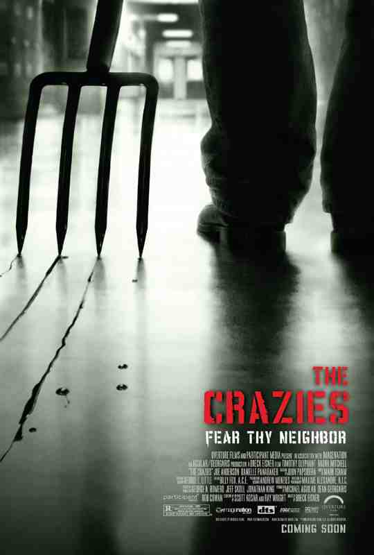
This poster fits many of the conventions of a horror poster. The image is dark which results in the background being almost black which is associated with horror and death. The background image is the silhouette of a man dragging a pitchfork along the floor, he's wearing dark trousers and big black boots which fits the mise en scene of a horror film. It's hard to tell if the image is black and white or not, if not, most of the colour has been trained to create a dull feel to it, with just the light of the hallway illuminating the silhouettes.
The colour scheme for this poster is mainly black, white and red. The title is in red capitals aligned to the right of the poster (as is the rest of the text, the caption credits etc). The font used reminds me of a large toxic plant or something similar, it's easy to read and it immediately catches your eye - being the only thing in red on the entire poster. Underneath is the caption in a more subtle white reading 'Fear Thy Neighbor' which gives us an insight into the genre of the film. It makes us realise that the film will be set in a small (possibly religious because of the use of 'thy') community where something goes horribly wrong.
The credits are underneath featuring the name of the actors, directors, producers etc. This is an important part of marketing the film and it gives all the people involved in the film recognition. The film company logo, sound company and others are featured small in white like the rest of the information.

Saturday, November 27, 2010

Font Possibilities

The caption of a film poster is very important as people remember it and it can also give us an idea of what genre the film is and what the story-line will be based on.
In our group, we have brainstormed different captions to go underneath the title of the film. We decided to go with hard hitting, mysterious phrases. This allows the audience to understand it is a horror film but they will not entirely understand what it is about.

Death Lives Here
Fear your thoughts
Insanity is infectious
It's our turn to adapt

'Death lives here' is perfect for what the film portrays so we have chosen this caption. It's simple, short and easy to understand. It also exerts a horror/macabre feel.
The title for the film is the most important part of the whole film.

The title can give the audience an idea of the genre and also be more memorable for people. For instance, we all remember the 'James Bond' font and the 'Spiderman font'. The font will be an ongoing theme throughout our Film teaser trailer, Film magazine cover and Film poster making it more memorable for the viewers.

Film name possibilities

The infant
The last drive
Pram
Two Girls One Road

All four titles link to the theme of the trailer and story. The name of the film and the font will be sure to give the audience a clear idea of what genre our film is. We needed the title to be bold and stand out on the posters so these are the four fonts we chose to pick from. We ended up going the the 'Nightmare' font as its bold but fitting in with the theme of the woods as it looks like twigs put together to spell the words out. This font will also be used for the caption however the caption will be of a smaller size and possibly a different colour as it's less important.